Zoom Cares
Zoom’s legacy is that it built the new digital infrastructure for global connection. Zoom Cares asks what that connection is actually for. When the team came to Kale & Flax, the challenge wasn't to build something from scratch. It was to bring the meaning behind Zoom Cares existence into a realized story. A visual language strong enough to carry the weight of real community investment, without drifting into the soft-focus philanthropy that makes most corporate giving feel like a footnote.
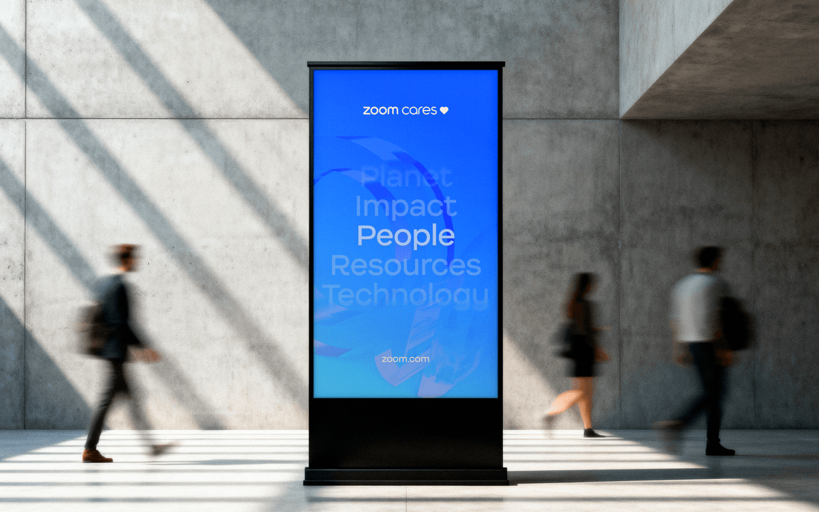
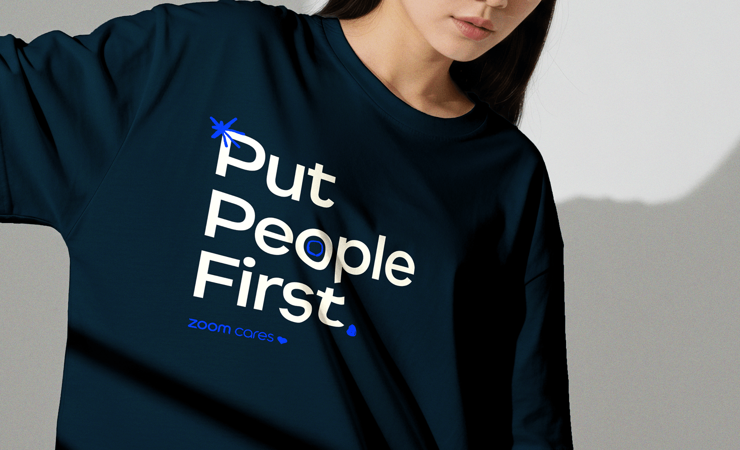
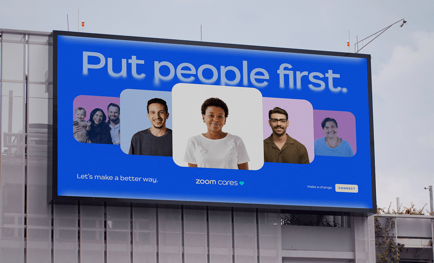
Sub-brands in tech giants tend to go one of two ways: invisible extensions or awkward departures. Zoom Cares needed a third option. A character of its own that felt unmistakably Zoom, but moved differently. We built that together with a photographic style rooted in warmth and proximity, illustration work that brought energy without losing humanity, and copy that said something specific enough to actually believe. The spark motif running through the system isn't decoration. It's the visual shorthand for what Zoom Cares does at its core: ignite the people and organizations already doing the work.
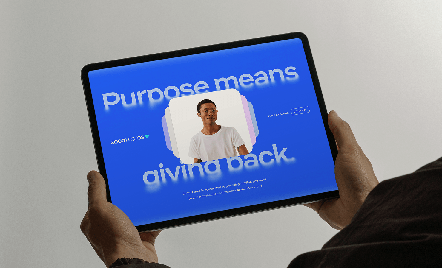
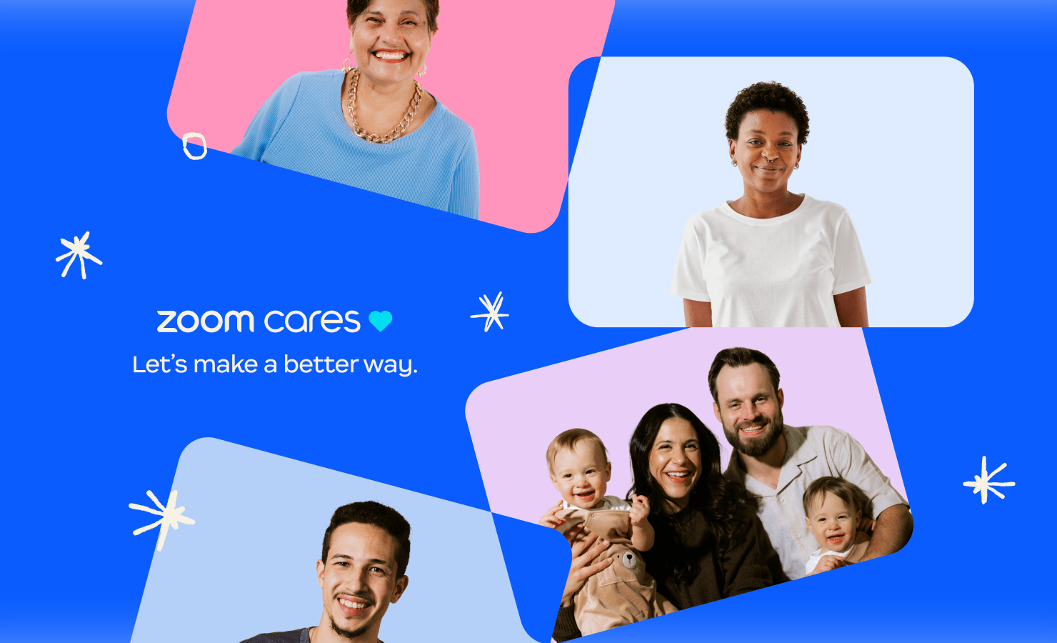
The result is a brand that doesn't ask you to trust it. It shows you who it's for. Not beneficiaries, not stakeholders, but real people, named and seen and centered in every frame. From digital campaigns to physical installations, the system holds because the belief underneath is that a company with Zoom's reach has a responsibility that goes well beyond meetings and phone calls.
2026